Showing posts with label Process. Show all posts

Monday, February 24, 2014

Pecos Bill: Comic Book Cover Process


Right after Christmas I was invited to contribute a variant cover to the Pecos Bill kid's comic book series created by Brian DuPont. Brian's Pecos Bill series explores the possibility that the legendary Pecos Bill lived throughout the centuries, and still has tall-tale adventures in the modern era. Throw in a steam-powered jet-pack named Widowmaker (created by inventor Nikola Tesla), and you have a pretty exciting adventure series.

The idea really appealed to me, so I went to work on a cover for Issue #3. The style I ended up with was a lot different than the work I usually do, but I was pleased with the finished product. I painted it from start to finish entirely in Photoshop.

Here are some progress shots to give you a small taste of the way this thing was put together:

I started out with a really tiny thumbnail sketch or two, and a digital color comp (that's pretty important in any color work I do. Really serves as a guide when I go into the painting stage).


The linework, completed digitally. This was a new step for me, but digital comic art linework is actually pretty great, especially if you have a brush that has a bit of variance and texture in it to simulate a real pen. I used one from this set by Shaun Bryant: https://gumroad.com/shaunbryant 


This is a pretty big jump from the last image, but hopefully you sort of get the idea. I start out with painting large areas of flat color. Then I use those areas as selections in order to paint details, more color, and texture over the flat color. The background is made up of some gradients, spatter brushes (for stars) and hand-painted comets! (soft brush+texture brush for tail). Nothing fancy!

So there you have it! I had to complete the entire piece in about 3 weeks in order to meet the deadline, so that was a challenge. I look forward to exploring comics further in the future. 

In the meantime, consider contributing to Brian's Kickstarter campaign - you can receive a print copy of my cover if you donate a little more! Check out the campaign here: 


And you can learn more about Brian and his comics here: 


Thursday, February 20, 2014

Fisherman's Song


As you may recall, last year I completed a new series of four new drawings to add to my portfolio. These were also included in the sketchbook "Drawing the Sword" which I also released last year. As part of that effort, I began coloring these pieces digitally. This was the only one I completed, but I really enjoyed the process, and I love the way the colors came out on it. I also submitted this piece, along with my Winter Dragon piece to the Spectrum Annual this year. It was my first submission to the publication.


Above is a bit of the progress that took it from basic idea to finished drawing. Unfortunately I don't have any WIP shots of the coloring process, but basically it involved large areas of flat color, then working my way up to the highlights and details with some various color adjustment layers over the finished color.

I wanted to convey sort of a carefree summer feeling with this piece. My brothers and I spent countless summer days exploring creeks and woods together when I was a kid. It's good to get out and explore your world. It makes you feel truly alive. That's what this Fisherman is up to with his turtle friend. They're just out there to enjoy the fresh air and to have a good time with each other!

Hope you like it!

-Will

Monday, December 23, 2013

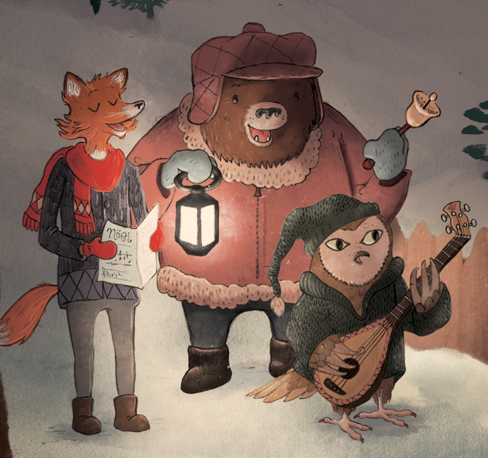
Carolers Process: Finish! (And a Merry Christmas to All of You!)

Tidings of Comfort and Joy

Here we are - the final! 
When we left off last post, I had just begun adding color to the painted elements that I had composed in the image. Now, many layers later, I've arrived at my finished piece. The basic process is just a lot of tweaking, color choices, adjustment layers (Overlay for the light areas) and texture brushes.

I hope it looks okay here on the web - I had some issues making sure that the color translated well to the web version (I painted it in CMYK, so I ended up exporting it as a PNG to make sure all the color information was intact.) I really enjoyed exploring this new method of working, and to be honest, I've learned a lot with this painting, and you'll be seeing much more of this process from now on!
 I'm really excited about this piece, and I look forward to exploring new territory in the New Year.


  So, I wish you all the Merriest of Christmases. I'm thankful for all of you and for this great gift of Illustration that we can share with each other!


PS: Today I opened my mailbox to find a lovely gift from illustrator Joe Sutphin! Inside were these beautiful signed prints and a kind note. Joe is a fantastic illustrator, and if you aren't familiar with his work, be sure and check it out here: http://joesutphin.blogspot.com/

Wednesday, December 11, 2013

Carolers Process Part II: Digital Composition & Coloring

 Hey guys! So, I haven't had a lot of time to work on this piece since the last time I posted, but I made sure to take some WIP shots of the compilation stage. Basically, I'm painting elements of the image separately, and then compiling them into a composition that I am happy with. 
 So, let's jump into it!

In the image above, I've scanned in a page of painted elements. They were all done in watercolor. After I scan these into the computer, I open the image in Photoshop where I convert it to black & white (or, Image > Adjustments > Black & White). Then I adjust the Levels until I have mostly black and a completely white background. In the images here, I actually made my levels too grey, which forced me to go back and re-do a lot of my work because the grey areas became transparent. (more on that later).
Also, note the cluttered desktop, and the Cory Godbey desktop background :)

Now I'm ready to copy everything to its own layer!

 This is a slow process. It's a good idea to have some music on to keep you motivated! (I've been enjoying the new Sigur Rós album, some Christmas music, whatever helps me work!) At this stage, I use the Lasso tool to select the element I want. I then Command + click on the RGB Channels in the Channels palette. I then invert the selection (Shift+Command+I) and make a new Layer. I then fill the selection with Black (Alt+Delete). After all this is done, I select all and copy to a new layer in my painting, and then place the new layer on Transparency Lock (it's a little button on the layer palette).
This might sound like a complicated process, but it doesn't take too long when you get it committed to memory.

Now all the elements are ready to be re-sized and moved into position.

Now that each of my elements are on their own layer and on transparency lock, I can start arranging them into a pleasing composition. This step seemed to take the longest. During the process I referred to my rough sketch frequently to make sure things were where I wanted them. Also, you'll notice that everything is a bit too transparent. That's because I didn't get the blacks dark enough in the previous Levels stage. That's important! But you can see that I'm starting to lay out the scene like I want it.

Since my layers are on Transparency Lock, this means I can color them however I want without having to do any complicated selections, so everything stays neat and tidy. At this stage, I'm just laying down basic colors. I've also discovered how to make some decent texture brushes, which I'll be using to add more color and texture to the final image. The characters are being colored here with just a flat color layer underneath the line work.

____________________
So that's about it for this stage! My goal is to have this image finished by next Wednesday, so watch this space for the final image soon. Let me know if this tutorial-type stuff is interesting to you. I want to try to give you all a glimpse into what I'm learning in hope that you'll in turn learn something as well.

And finally, I want to thank Chuck Groenink for his kind advice that he's given me personally and through his blog. I have been very inspired by his work lately, along with many others. The new methods of working I've been experimenting with are largely influenced by his paintings. Be sure and check out his work here: http://cargocollective.com/greenink

Next Time: Final Color & Texture!

Tuesday, December 3, 2013

Carolers Process Part I: Thumbnails & Drawing

 
Here's a new personal piece I'm working on. I'm going to be chronicling the new methods that I'm trying out lately here on the blog, so I hope you'll enjoy following along as I get this one put together!

For this first stage, I started with a very quick thumbnail. I had one idea in my head, and it worked pretty good in the first sketch, so I went with it. I scanned this sketch into Photoshop, where I hastily added some values on top of it. This is what I'm referencing mainly as I work on the image.


On this piece, I'm going to be creating the image with separate "parts". So instead of just putting all the line work down in one drawing, then painting it, I'm painting and drawing elements of the whole image separately so I can rearrange and edit the final piece in Photoshop.

I did each of these main character drawings in about 40 minutes.


For the next stage I'll be scanning these into Photoshop, 
adjusting levels, and separating the line work!


Next Time:  Painting, Compiling and Adjusting!

Saturday, November 23, 2013

New Directions: Part I

Here's a quick painting I did this afternoon. It took me around 2 hours. 

Lately, I've been very inspired by illustrators like Chuck Groenink, Meg Hunt, and Jon Klassen who create very texture-driven, more simplistic illustrations. This method of creating an image is really interesting to me, and I am really eager to explore the relationship between simple drawings and hand-painted textures and the final Photoshop image.

Overall, I'm pleased with the direction this image took. It's got a little more playfulness, color and texture, and that's what I'm aiming for. I think it's good to try to stretch yourself in new directions in your own work, and that's what I hope to do with the next several pieces. I hope to post more of these in the next week or so as I continue to explore new methods of working.


Tuesday, August 27, 2013

Beauty & the Beast: Watercolor

Taking a quick break from some LPG sketchwork to post my progress on the Beauty & the Beast piece that I worked on over the course of the TLC Workshop weekend before last. This is the final watercolor, with just one or two adjustment layers in Photoshop to bring life back into the scanned image.

I'm pretty pleased with the overall painting. Personally, I feel like this is one of the best "finished" watercolors I've ever done, although there is a great deal of room for improvement here. I really need to work on my application of the media - I tend to just mush the paint around with no objective for the strokes. In future paintings, I'll be trying for smoother layers of color.

The next step will be digital adjustments. Happily, I think I've gotten much more color information down in the painting than in the Winter Dragon one I did last time. Hopefully that will make the digital stage much easier!

Anyway, that's about it. What do you think? Keep at it, or go into a career in the Fast Food industry?

(JUST KIDDING)

Monday, July 29, 2013

Winter Dragon: Digital Finish

Winter Dragon - (watercolor & digital, 2013)

At long last, I have finished the Winter Dragon. 
What you see above is the result of close to 120 Photoshop layers, and much wrestling with color, lighting, pixels, adjustments, gremlins, and other adverse entities bent on making the life of a picture-maker total chaos.

It finally came to the point where enough was enough. There is only so much I can do to this image to make it successful. Ultimately, I felt like I was working very hard to offset the effects of a lack of planning in the early stages. This was a very uncomfortable feeling. 

Also, as layer upon layer began to accumulate in my palette, I began to ask myself: "why so many layers? Why is it taking this many layers to get this point across? Why wasn't there more color in the watercolor stage?" and on and on. A simple idea was requiring 20x the effort, layers, thought, and tweaking than it ever should have.

So to sum it up, I feel like in this painting, I won some and I lost some. In some ways it feels like it is succeeding, but in other ways it feels like it falls short of my original idea. But I'm ready to put this one behind me, and move on to bigger, better things.

Or maybe simpler things. If there's one thing this painting has taught me, it's this: Less is, more often than not, more.

Friday, June 7, 2013

Winter Dragon: Drawing & Color Comp


Yesterday I put the finishing touches on a drawing that I started back in January. It was in response to an ArtOrder Challenge entitled "Winter Dragon". The challenge was to come up with a Dragon and give it characteristics that displayed how he interacted with the world around him. Or something like that. Anyway. It was January. I got started on a much more serious, depressing, savage, dragon-killed-my-family-and-destroyed-my-homestead type piece, and had some great sketches (which I might finish at some point). But instead I opted for a much more light-hearted scene. Two dwarves and their dragon pal having a cookout. I was pretty pleased with how the drawing came out, but still trying to find that balance between being too sketchy and being a tight, finished drawing that isn't too detailed or over-cooked. So, there you have it! Tomorrow I'll be working on starting the watercolor stage (which I'm pretty nervous about). Hopefully we'll end up with a final image that will look something like the color comp above, but with much more detail.

See you then!

Monday, December 24, 2012

Merry Christmas!

Wishing all you wonderful blog readers out there a Merry Christmas and a Happy New Year!
This is an illustration of a changed Mr. Ebenezer Scrooge and a grateful Tiny Tim that I did for a Christmas card this year. I was pushing it for time, and barely got it sent to the printers in time. But I managed to send several out to friends and family.
Here's a bit of the process I used to create it - I used this project as a chance to
apply what I'd learned from Cory Godbey's "Fox" demo (which I really can't recommend to you enough). I look forward to continuing to explore more digital/traditional techniques in the coming year. Here's a bit of how the project progressed:

 Final drawing, scanned, cleaned up, and levels adjusted.
 Linework adjusted to a warm color, sepia underpainting on the characters.
 Flat color added.
 Adding in some lighter colors.
 Pushing the light and dark colors.
Painted texture applied over the characters with a layer mask.


Texture applied over background.

Color balance layer applied over the background, with local color added to the background elements.
And Finished!

___________________

Merry Christmas everybody! Looking forward to sharing some new projects 
with you in the coming year!