You need it. I need it. Everyone needs it! It's the 2010 Missile Mouse giveaway from Jake Parker!
Jake draws the amazing Missile Mouse, a space-traveling super-agent who stars in a his own brand new episode: MISSILE MOUSE: RESCUE ON TANKIUM3!! You can win this plus a ton of other cool cargo. Just check out how to enter over at Jake's blog, Agent44. Good luck!
Wednesday, December 29, 2010
Friday, December 24, 2010
#064 The Fab Four
Thursday, December 23, 2010
Tuesday, November 16, 2010
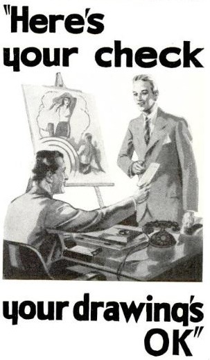
#062 OK
"Really? Thanks Boss!"
I wish my real boss was this friendly.
And that I was drawing for a living.
I got paid $50 bucks for a drawing once.
And people all over town saw it.
But that's another story.
In the meantime, I will continue drawing.
Because I draw for a living.
Even if I'm not getting paid to do it.
I wish my real boss was this friendly.
And that I was drawing for a living.
I got paid $50 bucks for a drawing once.
And people all over town saw it.
But that's another story.
In the meantime, I will continue drawing.
Because I draw for a living.
Even if I'm not getting paid to do it.
__________________________
via Drawn!
Labels:
Drawing,
Illustration,
Life,
Like+Love,
Retro/Vintage,
Whatever
Sunday, October 31, 2010
#061 Performance
Here's a great little short film by Graham Annable to get you in a spooky mood!
I love this little duo, and I think they should get a manager and start touring together.
Labels:
Animation,
Cartoons,
Like+Love,
These People Create,
Whatever
Thursday, October 28, 2010
#060 Warrior Preliminary Sketches
Wednesday, October 27, 2010
Tuesday, October 26, 2010
#058 Master Copy Pt. 2: Finish
Here is the Michelangelo copy from last week with all the final shading in place. This is really the first drawing I've done this semester that I feel truly proud of. I was really pleased with the head and hands, which I'm not always the best at drawing. Overall the proportions came together rather quickly, which is nothing short of a miracle for me!
Labels:
Art,
Charcoal Studies,
Drawing,
School,
Sketches
Monday, October 25, 2010
Sunday, October 24, 2010
#056 Make Something Cool Every Day
Well, it's finally here. I am beginning a project called MAKE SOMETHING COOL EVERY DAY. We'll just call it MSCED for short okay? The title isn't exactly original - I was inspired by many artists who have projects that are titled exactly the same, such as the great Mark Weaver and this post on ISO50. I wanted to do this project to keep my creative juices flowing continually all the time, forcing me to create every day until I collapse in exhaustion. Because that's what great artists do! To get my brain to come up with creative things every day will help me improve my techniques, learn new ones, try out ideas, etc. So I hope that you will enjoy this little project, and I will be posting new stuff as soon as it arrives!
Labels:
Creativity,
Graphic Design,
MSCED,
Photoshop,
Retro/Vintage
Saturday, October 23, 2010
#055 Headless
Here's a quick sketch I did today in response to this challenge.
The colors are so muddy and dark. I hate it! But that's trial and error in Photoshop for you. The point is I had fun. This is also a kind of preview of something I've got in the works which I'll be telling you about soon. I'm pretty stoked about it.
This drawing doesn't creep me out though. I wish it did. Maybe I can think up something creepier. I'll let you know what happens...
#054 Master Copy Pt. 1
This weekend I'm copying a drawing entitled Libyan Sybil by a master artist. If you don't know him, you should. Michelangelo was a true master, and trying to replicate what he drew roughly 500 years ago is a mind boggling thing. It makes you feel very humble, and honored to follow the footsteps of such a great artist. These are just the early stages of the drawing: a gesture drawing, followed by a light lay-in of midtone with a chamois cloth.
Up next: The shading.
Labels:
Art,
Charcoal Studies,
Drawing,
School,
Sketches
Saturday, October 16, 2010
#053 Steam Conquistodores
A drawing from late 2008-09. Made of wood, brass, and salvaged machine parts, these steam-powered conquistodores were deployed with archaic weapons to beat a small island-empire into submission to an evil dictator. The machines proved faulty however, and local warriors promptly forced them over the cliffs into the churning ocean where they remain to this day.
Sunday, September 26, 2010
#052 Three Webcomics That Your Eyeballs Will Love
Today I thought I would highlight three webcomics that I have been enjoying the last few months that are definitely worth your eyeballs' undivided attention. So without further ado, here they are:
1. BIT AND RUN by Cory Godbey.
If you're a Mario, Zelda or Pokémon fan, you will definitely be in love with Bit and Run. A tribute to all things Nintendo, Bit and Run is now in its second "season", being written and published by Greenville, SC illustrator Cory Godbey on his blog, light night rains. While I'm not generally known as an avid gamer, I have been known to play my share of Kong on an old GameBoy Color, and the comic really captures the feeling of 8-bit color, characters, and environments of Nintendo. Cory has also stepped up the scope, color and humor of the series, which makes it all the more fun!
2. OH, BROTHER! by Bob Weber, Jr and Jay Stephens.
Bob Weber Jr. has been one of my favorite cartoonists since I was a kid, and now he has created a new strip called Oh, Brother! While this strip is being published in the papers, it does have its own website where you can subscribe to the strip, so technically it's a webcomic. The strip focuses on Bud and Lily, a brother and sister who just do kid stuff. Usually Bud gets on Lily's nerves, but they still love each other when it's all said and done. What I love about Weber's style is his simple line work, humor, and layouts. This strip feels like a classic, and I hope it becomes one.
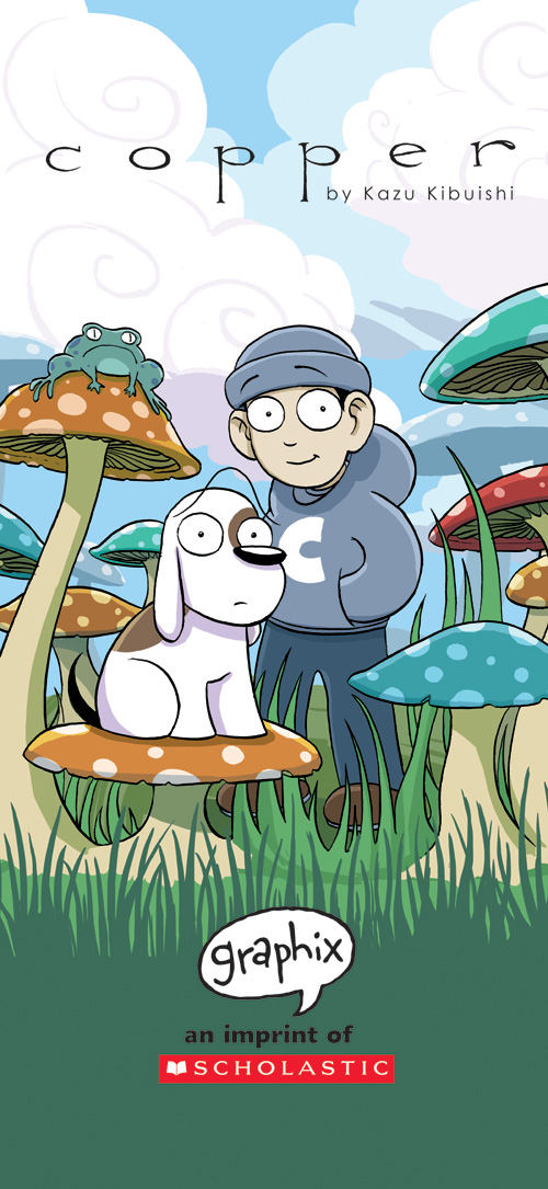
3. COPPER by Kazu Kibuishi
I honestly can't tell you what the setting of Kazu Kibuishi's Copper is, but I do know that one look at these trippy, colorful animated pages, and you will be hooked. Each Copper installment is a whole page devoted to the adventures of Copper and his dog Fred. It seems as though the duo is nomadic; they are never in the same place twice. They explore forests, waterfalls, cities, flying machines, and all kinds of fantastic things. The best part is just getting to pore over page after page of Kibuishi's artwork. It is wonderful, and if you're interested, his site also includes a step-by-step explanation of how he creates his Copper pages. It's a gold mine!
So: go out and read some comics!!
Saturday, August 7, 2010
#051 "Who's Scruffy Lookin'?"
My favorite Star Wars by far.
I'm really wanting to get these sweet 1980 Marvel comic book adaptations. Dark Horse has just published a reissue, but I would love to have an original edition.
Thursday, July 8, 2010
#050 Honor
Much improved over yesterday's post. I think I have a better sense of layout & color, and I'm beginning to understand masks a little better. Things really improved when I finally convinced myself that the animal motif didn't necessarily have to be in place (ie, the bison from last post). I tried a fox and that was a big flop. I like where this is going so far.
Labels:
Creativity,
Graphic Design,
Illustration,
Photography,
Photoshop,
Retro/Vintage
Tuesday, July 6, 2010
#049 Patriot
An experiment in Photoshop using images pulled from Flickr and a little bit of Illustrator type editing thrown in. Design-wise it's a little weak, but it was meant to keep my Ps muscles from atrophying. Hopefully this will be the first in a series... tell me what you think!
Inspired by Mark Weaver's Make Something Cool Every Day.
Thursday, May 27, 2010
#048 Morgan Part II: Final
Morgan Freeman (charcoal on paper, 18"x24"), 2010.
My professor, Mr. Jesse Mangerson considered this my best drawing of the Spring semester. Although there are several things to improve here, I would have to agree with him. After completing this I really want to delve into portraiture more, especially now that I realize that it is an achievable goal, and an enjoyable one at that.
Labels:
Art,
Charcoal Studies,
Drawing,
Illustration,
School
Thursday, May 20, 2010
#047 These People Create: Tycho
Scott Hansen is back in the studio...
You may remember a post I did several months ago about the amazing design powerhouse ISO50, headed up by designer Scott Hansen. What you may not realize is that Hansen also fronts a band named Tycho. The band, which is signed on the Ghostly International label (Phantogram, christopher willits, Choir of Young Believers), has a distinctive sound, using warm synth tones, sampled vocals, acoustic guitars, all painted onto a warm bed of softly crackling analog tape noise. The sound has been compared to that of Boards of Canada, but to me Tycho feels much warmer and friendly than starker electronica music.
But the great news is that the band is back in the studio working on brand new batch of songs that could come out in early 2011. Hansen mentioned in a blog post about the new album's progress that he recently came out of an extended period of songwriting, in which he developed a few album's worth of material. Now he says that "the past couple months have been the most productive of my musical life". Needless to say, I am eagerly anticipating this release, and am confident that my expectations will definitely be exceeded.
See the progress post with more pictures and a detailed report of what's going on here at ISO50's blog.
Labels:
Creativity,
Graphic Design,
Like+Love,
Music,
These People Create
Tuesday, May 18, 2010
#046 Ares
Ares: god of war!
Our final project last week in Digital Media 1 was to complete our photo composite representing a Greek deity of our choice. I chose Ares who is supposedly the god of war and bloodshed. And judging from this photograph, he is also god of explosions and pyrotechnic disaster.
There was a lot of preliminary work involved leading up to this point though. I had to photograph myself in rough poses to explore the mood and feel of the character, and to get something to show my model and explain to him what needed to be done.
Secondly, I recruited my younger brother to play the part, and he was fairly willing to oblige as long as he didn't have to "take his shirt off". He struck some nice poses, and the costume artist (my mom) did a fabulous job coming up with a decent costume in about 30 minutes (thanks mom!).
The most difficult thing was my stupidly photographing the model 1/2 in shadow and 1/2 lit, which is not good when you're working with other photos, etc. So I had to work around that quite a bit, using the Dodge tool in Ps to even out some of the darks on the model.
The final image is made up of close to 10 or 12 different images, and I ended up with around 20 layers. The interesting thing is that the overall image looked a lot warmer in Photoshop than it does now in the browser. I'll have to remember that next time...
So there you have it - the god of WAR!!!
Sunday, May 16, 2010
#045 Morgan
The preliminary sketch for my final project in Analysis of Form. We're doing portraits from photo references. I'm doing Morgan Freeman. You can see the grid I used which was also drawn on the reference photo, but in the end they were both measured wrong, so my drawing came out wrong. So I had to ignore the grid, and use my sight-measuring superpowers to get it back to normal. Roughin' it!
Next Week: The Final Drawing!
Saturday, May 15, 2010
#044 Guardians of the Desk
For about a week now these stalwart guardians have been holding down security here at the Illustration Desk.
Call me weird, but I still have a great love of Legos. I built with them all the time when I was a kid, and would spend a whole day working on massive projects of imaginative grandeur. It was the way I built my own sci-fi and fantasy worlds, and to an extent, I still occasionally try those ideas out in Lego bricks now.
These Rebel soldiers are ready for anything the Empire throws at them. I love the details the figures have... just like they were in ESB. My goal someday: have a little converted closet in my house with all the Lego Star Wars models I can get my hands on - all in a diorama setting. How's that for a geeky kid's dream?
Get your own at lego.com.
Thursday, May 13, 2010
#043 Eyjafjallajökull
Iceland, Eyjafjallajökull - May 1st and 2nd, 2010 from Sean Stiegemeier on Vimeo.
The infamous volcano in all its terrible glory. How beautiful is such a powerful thing. How great the One who performs such miracles.
I have always wanted to go to Iceland, and this 2 minute time-lapse film just makes me want to go more. Also enjoyed the seemingly Sigur Rós-ish soundtrack which was gorgeous.
Video by Sean Stiegemier, who you can visit here.
If you wish to purchase me a ticket to Iceland (and maybe one for a friend or two), just leave a comment in the comments section. Thanks!
Friday, May 7, 2010
#042 Swell
A beautiful poster for the Swell Season by graphic design team the Small Stakes.
This is graphic design in its sweetest, simplest, most profound, most innocent and unassuming form.
Go buy a print at their website.
Found on Grain Edit.
Thursday, May 6, 2010
#041 Your Facial Hair Makes a Statement
So, can you be trusted?
Unfortunately I'm probably on the FBI beard list located close to the Werewolf under "Dangerous".
I think it's time to shave.
Found on the wonderful blog of Mollie Greene, Fresh Milk Delivered Daily.
Unfortunately I'm probably on the FBI beard list located close to the Werewolf under "Dangerous".
I think it's time to shave.
Found on the wonderful blog of Mollie Greene, Fresh Milk Delivered Daily.
Saturday, April 24, 2010
#040 In Technicolor
A study this week in Photoshop's Hue/Saturation layers settings and black & white image colorization. I don't know what movie this is from, but the actress is Kathleen Burke, and if I'm not mistaken (and I probably am) that's Gary Cooper with her.
Here's the original black & white movie still:
Labels:
Illustration,
Movies,
Photography,
Photoshop,
Retro/Vintage,
School
Tuesday, March 23, 2010
#039 The Evil Dr. Doom
It has Arrived.
Behold, the terrible Dr. Doom. Here is a brief description found in a decrepit journal:
"Dr. Doom was a colonel wounded in battle in the British Occupation of India in the 1850s. Horribly disfigured for life, he returned to London years later a shattered man. He sought out the help of an innovative surgeon who completely rebuilt him into the Terrible Dr. Doom. Roaming the dark streets of London wielding his fearsome claw he cries: "I Shall Have Vengance!!!". He never got it."
So, there my friends is the brief account of this sad Victorian individual. We can learn from this unfortunate tale that: (A) The streets of London at this time were highly unsafe, (B) bionic surgery was indeed taking place at that time, and (C) prolonged periods of Photoshop use can at times do funny things to your mind, causing you to think up wildly outlandish explanations for the ridiculous nonsense you are creating.
We will go out with this final scratchy photograph, nearly lost by hundreds of years of decay and mildew, but restored to its former glory with Photoshop, of the brave surgeon's operating table.
Behold:
The Construction of Dr. Doom, C. 1850.
Labels:
Creativity,
Illustration,
Photoshop,
School,
Whatever
Thursday, March 18, 2010
#038 Something Wicked This Way Comes
It's coming.
Get ready.
This week in ILL 133 we are using Photoshop to create a steampunk-ish composite image using this fantastic lithographic clip art. Only time will tell what evil shall ensue...
Stay Tuned.
________________
* Side Note: This post has nothing to do with the 1983 film "Something Wicked This Way Comes" which is based on the book by Ray Bradbury. But in a way it does, because that title has been running through my head for weeks. Thank you. You're dismissed.
Saturday, March 6, 2010
#037 These People Create: Cédric Delsaux
It seems that the universe is getting smaller all the time... and here's proof.
I recently stumbled onto the amazing work of Cédric Delsaux via ISO50's blog (read a previous post about them here), and needless to say this stellar project is beautiful, mysterious, humorous and terrifying all at once. The seamless way Delsaux blends the vehicles and characters of Star Wars with real world photography from photo shoots in France, Dubai, and elsewhere is no less than stunning. Although I don't know much about his process, I am %99.99 sure that Photoshop is involved, with maybe a little Maya, Lightwave, or Modo 3D modeling software thrown in. But what really sells these photos is the sense of realism, and a phenomenally original and creative idea, which seems to have served Delsaux well.
Posted above are a few of my favorites. Lord Vader looks particularly stunning and Gothic beneath those imposing European windows. The good old Millennium Falcon is more spry than ever. Jango Fett is about to make an arrest in the headlights of a Citroen.
And the last photo just really sends shivers down my spine. Let's just say if you ever see this in real life, you're in big, big, big trouble.
Visit Cédric Delsaux at his website here.
Labels:
Creativity,
Like+Love,
Movies,
Photography,
These People Create
Wednesday, March 3, 2010
#036 Draped and Folded
This week we are studying the analysis of the four folds in fabric. It is a difficult subject to draw, but I found it surprisingly easy at the first stage, sight measuring angles and proportions. It seemed to only take 30 or 40 minutes to get that part done. Once I started to block in the basic light & dark however, it seemed like I got a little confused. But I think it's going to look great once we get the five values in and all rendered up.
Still waiting for feedback & permission to proceed from Professor Mangerson, so in the meantime I'll just work on the rest of my classes and hope that it doesn't somehow fall off the wall, or get pulled off by one of my two cats who have been expressly banned from entering my studio.
Friday, February 26, 2010
#035 These People Create: N. C. Wyeth
I have long considered N. C. Wyeth to be one of my inspirations, but until yesterday I never realized the magnitude of his work. Working on a discussion for my class, I stumbled upon the official Catalogue Raisonné website that features virtually every painting, drawing and illustration done by this amazing artist. The most interesting to me were the various magazine illustrations done for publications such as Ladies Home Journal, and Progressive Farmer. These were fascinating and covered a wide range of genres & periods. Another surprise was the numerous Bible stories illustrated by Wyeth, which were very unique in their concept and rendering.
It seems to me that Wyeth's work resembles the work of Dutch masters in color and the treatment of light. It was so insightful to see some of his work other than the famous Treasure Island, Kidnapped, and Pilgrim paintings that he did. Discovering this diverse and lively portfolio was like opening a treasure box, and it gave me a fresh motivation to be active in understanding light, color, composition & figure. I would be honored to follow in the footsteps of such a patriarch of modern illustration.
_____________________________
Above:
N. C. Wyeth (1882-1945)
The man with the hatful of cards picked a hand out of his reserves, put the hat on his head and raised Bill a hundred. Bill came back with a raise of two hundred, and as the other covered it he shoved a pistol into his face observing: "I'm calling the hand that is in your hat."
1916
Oil on canvas, 32 x 40 in. (81.2 x 101.5 cm)
Private collection
N. C. Wyeth (1882-1945)
Marget was cheerful by help of Wilhelm Meidling
1916
Oil on canvas, 40 x 32 in. (101.5 x 81.2 cm)
Private collection
N. C. Wyeth (1882-1945)
There she was, the Dancing Bess , holding a taut bowline to the eastward. And there were the two frigates, but they might as well have been chasing a star.
1911
Oil on canvas, 45 1/2 x 37 1/2 in. (115.5 x 95.2 cm)
Location unknown
Please visit the N. C. Wyeth Catalogue Raisonné and click "Catalogue Search".
Labels:
Art,
Drawing,
Illustration,
Like+Love,
These People Create
Subscribe to:
Posts (Atom)