Showing posts with label Retro/Vintage. Show all posts

Monday, August 13, 2012

Act The Miracle - Desiring God Art Contest


"Act The Miracle" 
Photoshop collage 5" x 3.5" 

About a week ago, Desiring God (the ministry of John Piper) announced a graphic design contest to find posters for an upcoming conference on the topic of Sanctification. Thankfully I heard about this just in time to participate, and over the weekend I struggled through a rough start and eventually arrived at the final. The finished image is not exactly what I had originally planned, but I think I managed to convey somewhat of a "quiet struggle" within a man who represents you & me. The best part however, is the fact that there is not a lot of "me" coming through this image. Sure, it's infused with my own design taste and sensibilities, but I get the exciting feeling that God will send a message through this poster that I'm not aware of. Sort of like I didn't put my own message in, but it will speak for itself.
I was very thrilled to have the opportunity to use my artistic abilities to glorify God - the True Creator.

Onward, for His Glory.

________________
 10 or so designs will be selected by the Desiring God team, and will be put up on the DG Facebook page. Voting begins Wednesday, August 15th 2012. If you're on FB, please go check out the gallery and vote (even if my design doesn't make it!). Go show these designers some love.

-Will

Tuesday, July 24, 2012

The Old Made New


As well as being an illustrator who loves to draw and paint, I also like to snap a few pictures when the occasion arises. I would love to someday own a SLR of some sort, but until then, I have discovered that my iPhone takes rather nice photos, and with the help of a few apps, can really turn them into works of art. 


A few months ago I was in Southern Kentucky, and had the opportunity to explore an old school, built around 1937 or so. The amazing thing was, it was abandoned, and everything seemed untouched. It was as if I could hear children answering questions and cheering upon hearing that summer break was about to commence. It was a haunting experience.


 "Commisioner of Agriculture" ... I wonder if this was his desk as a child?


The front entry way of the school. The principles office was like a crow's nest overlooking the front walk (above).


Vintage electricity and heating systems.


This typewriter was simply lying in the floor, most likely thrown in the floor by vandals (there was quite a lot of evidence of their visits).


Grain elevators and a railway were behind the school. And the clouds were just right.

I used VSCO CAM, an app with a myriad of controls to take and manipulate these images. It's available for iPhone and iPod touch on the app store, and in my opinion, well worth .99 cents. You can learn more about it here
History and old things are amazing to me, and to stumble upon a place like this was almost like stepping into a time machine. Hope to share more photos in the future here on the blog. 


Wednesday, July 18, 2012

#164 To Everything A Season

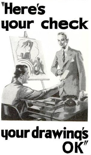
Quick Sketch of a Dude from the 1960's *
*this is not a self portrait. Unfortunately I don't look this cool.
*Also this image has very little to do with the actual blog post below.

   
Just a quick post to update everyone on some changes that I have in the works for Drawing the Sword, and some changes that have already taken place.

1. Blog Changes - Over the coming weeks I will be slowly but surely making some significant aesthetic changes to the blog interface. This will include (hopefully) a redesigned header, a visually unified series of buttons/banners for the sidebar, etc. I want this thing to look good.

2. More Posts - I will be trying to be posting LOTS more in the future. I don't want to bore you with sub-par sketches, but I'm working like crazy to build up a portfolio, so there is going to be lots more to show you over the coming weeks. Also, I may start posting more stuff about what inspires me, what things I'm thinking about. I want this blog to be somewhat more personal, I want it to be a place where you can come to get inspired.

3. Lose the # System - This is something that is bittersweet for me. After a lot of thought, I think it would be better for everyone to stop "numbering" the posts. It was an integral part of the concepts I had when brainstorming the blog, but I think it's something has run its course.

4. Unveiling my Etsy store! - I'm in the process of setting up an Etsy store for Drawing The Sword. It will be an integral part of the Drawing the Sword online presence, and I hope to sell original paintings, drawings, art prints, cards, bookmarks, and possibly an occasional comic:) I will be updating you with more information on this as it comes, so stay tuned! Also, I'm looking for art print services that are reliable and produce quality results. If you've had any experience with this type of thing, please leave a comment on this post. I would love to hear of printing services you have had success with in the past.

5. New Gallery & Contact Page - I've also set up a 2nd blog (which was about the only way for me to create a dedicated portfolio page) where I've posted some of my best work. I'll be regularly updating this, so check back frequently. I've set up a contact page as well, so if you have any project inquiries, questions, or just want to chat you can check it out. The links are right up there next to my profile pic.

So that's about the shape of things. I hope to make this blog a much more exciting place from now on! Glad you're reading, and I hope you're feeling inspired already.

For everything there is a season, and a time for every matter under heaven
Ecclesiastes 3:1

Tuesday, December 20, 2011

#138 More Card Designs


- click images for larger size -

I have really been doing a lot of graphic design lately, and honestly I've been enjoying it immensely. I get a thrill out of arranging images, text, and colors harmoniously (you can be the judge of that). This set of cards is going to be part of a paper goods gift box for a gift exchange I'm participating in later on in the holidays. And as I'm sure you can tell, I'm a big C. S. Lewis fan. I hope that whoever gets these is too!

It would be awesome to see if there's any demand for these things. If so, I could start offering them on Etsy. Just give me a shout. You can make it happen!

And hopefully I'll have at least one illustration post before Christmas - just hang tight!

-Will

Tuesday, December 13, 2011

#137 New Year Postcards


front


back

alternate version


My family will be hosting a New Year's Day party soon, so I offered to come up with some invitations for them. The postcards were designed in Photoshop by scanning in some Alaska graphics from a 1960's book (I adore that look). Used the free typeface Mod from Font Fabric
and created a layer mask from it. My mom said her decorating theme for January is snow, so I wanted something minimalistic, snowy and cold. The vintage graphic and the turquoise blue keep it from getting to stark, adding a little warmth to the overall feel.
The last image is an alternate design that didn't make the cut.

Monday, December 5, 2011

#135 Mollie Greene's Make & Do Holiday Giveaway!

Make & Do: Paper Fascinations for Every Lovely Occasion

I love a good giveaway!
So I really want to tell all ye good folks about Mollie Greene's amazing paper work, and her cool new book which she is giving away on her blog here: molliegreene.com I love anything that re-purposes vintage paper into cool stuff that you can enjoy. So enter the giveaway and spread the Christmas Cheer! And thanks so much Mollie for this sweet giveaway!

About Make & Do:
Released in September 2011, Mollie Greene's paper craft book Make & Do: Paper Fascinations for Every Lovely Occasion includes tutorials for old Royal Buffet favorites and new soon-to-be Royal Buffet favorites, Mollie's best pointers for working with paper, and fabulous photography that walks you through each step of the way. A perfect gift for yourself or for anyone who can handle scissors.

Links:
http://molliegreene.com/

http://www.etsy.com/shop/royalbuffet?ref=top_trail

Monday, July 25, 2011

#089 Just For Fun

Here's a ten-minute Photoshop job for ya. Just for the heck of it. I'm really into Apollo missions, space stuff, and Polaroid color photos right now. So there ya go. Have fun.

Saturday, February 19, 2011

#069 Atom Boy


A project that was finished this week in Photoshop. I chose to design a movie poster using only old photos scanned from 1960's era books. It was fun and a challenge, and FYI "Atom Boy" was originally going to be a hippie, but I couldn't find one.

Also, you will notice that Atom Boy is played by a very young Harrison Ford, with special effects by Ray Harryhausen, and an original soundtrack by the Moody Blues.

Unfortunately the film was scrapped at the last minute due to budget concerns, but in later years the unedited version became a cult classic. In Japan.

Thursday, December 23, 2010

#063 Merry Christmas!

Merry Christmas to all, and to all a Good Night!

-Will-

Tuesday, November 16, 2010

#062 OK


"Really? Thanks Boss!"

I wish my real boss was this friendly.
And that I was drawing for a living.
I got paid $50 bucks for a drawing once.
And people all over town saw it.
But that's another story.
In the meantime, I will continue drawing.
Because I draw for a living.
Even if I'm not getting paid to do it.

__________________________
via Drawn!

Monday, October 25, 2010

Sunday, October 24, 2010

#056 Make Something Cool Every Day

Well, it's finally here. I am beginning a project called MAKE SOMETHING COOL EVERY DAY. We'll just call it MSCED for short okay? The title isn't exactly original - I was inspired by many artists who have projects that are titled exactly the same, such as the great Mark Weaver and this post on ISO50. I wanted to do this project to keep my creative juices flowing continually all the time, forcing me to create every day until I collapse in exhaustion. Because that's what great artists do! To get my brain to come up with creative things every day will help me improve my techniques, learn new ones, try out ideas, etc. So I hope that you will enjoy this little project, and I will be posting new stuff as soon as it arrives!

Thursday, July 8, 2010

#050 Honor

Much improved over yesterday's post. I think I have a better sense of layout & color, and I'm beginning to understand masks a little better. Things really improved when I finally convinced myself that the animal motif didn't necessarily have to be in place (ie, the bison from last post). I tried a fox and that was a big flop. I like where this is going so far.

Tuesday, July 6, 2010

#049 Patriot

An experiment in Photoshop using images pulled from Flickr and a little bit of Illustrator type editing thrown in. Design-wise it's a little weak, but it was meant to keep my Ps muscles from atrophying. Hopefully this will be the first in a series... tell me what you think!
Inspired by Mark Weaver's Make Something Cool Every Day.

Saturday, April 24, 2010

#040 In Technicolor

A study this week in Photoshop's Hue/Saturation layers settings and black & white image colorization. I don't know what movie this is from, but the actress is Kathleen Burke, and if I'm not mistaken (and I probably am) that's Gary Cooper with her.

Here's the original black & white movie still:

Sunday, December 20, 2009

#029 Away


My dad brought home these cards from the bookstore the other day, and they are cool. We all know I fall for the neo-vintage (what a ridiculous term).
It's a reissue of an old lithograph card featuring the Nativity. There is gold leaf around the border, and in the garland background. And that verse is one of my favorites.
_____________________________________
Wishing everyone a Merry Christmas, especially those of you in the East who are definitely having a White Christmas this year. Stay warm!

Tuesday, December 15, 2009

#028 These People Create: ISO50


This fantastic graphic design has been magically crafted by San Francisco's Scott Hansen. I could hardly catch my breath when looking through his electrifying portfolio and his amazingly gorgeous website (I might say here that too often portfolio sites are poorly managed, but here I was pleasantly surprised).

The ever-informative and inspiring GrainEdit featured an interview with Hansen on their blog, and I was struck by the effortless way his work shifts in to the vintage realm without seeming outdated. His use and love for 1970's era Swedish typography, the slightly distressed appearance of vintage photos and stunning linework make his posters, prints and design irresistible.

One of the most interesting things about this multi-faceted designer is that he creates music on vintage recording equipment. Using synthesizers, tape recorders, and acoustic guitars, he sculpts beautiful electronica music that has a welcoming warmth to it that many artists of the genre reject in favor of cold, harsh, computer noise. He then presses these recordings onto 45's, as well as MP3's, creates sumptuous cover art, and then sells them on his website under the name Tycho.
Will somebody please, please, please get me an introduction? I would scrub toilets for this guy for 50 cents a week if it meant I could spend time in his studio.
______________________
You can read the full interview at GrainEdit here, and you absolutely must see Scott Hansen's ISO50 website which is here. Sit back, and be amazed.

Thursday, December 3, 2009

#025 Typography from the Past


Over Thanksgiving I had the opportunity to visit the Roanoake Virginia Transportation Museum. Due to its proximity to a vital rail-yard, it featured a lot of locomotives and railway history exhibits. I've loved trains since I was a kid, but during my visit I was struck by the beautiful typography that so many of the rail lines of the early 1900's used in their logos and branding.


Progressive shots showing the lettering on the side of a coach.

One of the most amazing things I saw was this old streetcar.


The exterior reminded me of a VW Microbus, and its paint was old and powdery, like so many other vehicles in the yard. But walking inside, it was like walking into the past.


It looked as though nothing had changed for 35 years. And there were ads, original ads still hanging above the seats. I felt as though I had walked into a sanctuary. So many people had ridden this streetcar. Each one had their own ideas, problems, loves, hates, dreams, hopes. America was going through similar economic hardship just like we are today, and these ads were rallying the people: work together, and together we can make it better. Something truly American. For whatever reason, I was so struck by this streetcar. Even time cannot erase the voice of the people.

Wednesday, December 2, 2009

#024 Board of Bored Executives

"They'll vote with Potter otherwise!"

This is the 2nd poster in the Interbank series created this week. In case you don't get the joke, no one in the photo is happy with their insurance agent or their rates. Yeah. Now you get it. But unfortunately I cannot resist using vintage photographs and spending a whole hour poring over these archives.

Monday, November 30, 2009

#023 Low-Tech & Lovin' It

Golly! This thing really works!

I hope that my ad works and that the message is loud and clear. I really want this one to work out because I used archived photos (not stock photos mind you) in this assignment, and even though it wasn't specified not to use them, I am a little skittish about the whole thing. But with 3 days of Thanksgiving travel, I was pressed for time, and this one served the purpose.

You can get cool old pictures just like me. Just go here.