Showing posts with label Painting. Show all posts

Thursday, February 20, 2014

Fisherman's Song


As you may recall, last year I completed a new series of four new drawings to add to my portfolio. These were also included in the sketchbook "Drawing the Sword" which I also released last year. As part of that effort, I began coloring these pieces digitally. This was the only one I completed, but I really enjoyed the process, and I love the way the colors came out on it. I also submitted this piece, along with my Winter Dragon piece to the Spectrum Annual this year. It was my first submission to the publication.


Above is a bit of the progress that took it from basic idea to finished drawing. Unfortunately I don't have any WIP shots of the coloring process, but basically it involved large areas of flat color, then working my way up to the highlights and details with some various color adjustment layers over the finished color.

I wanted to convey sort of a carefree summer feeling with this piece. My brothers and I spent countless summer days exploring creeks and woods together when I was a kid. It's good to get out and explore your world. It makes you feel truly alive. That's what this Fisherman is up to with his turtle friend. They're just out there to enjoy the fresh air and to have a good time with each other!

Hope you like it!

-Will

Saturday, January 11, 2014

Bird of Paradise - Experiment in Gouache

A quick color experiment in gouache from the other night. Didn't have a specific purpose in mind for this one, except to try out the new gouache set I got for Christmas! I absolutely love gouache. I think I'll be using it much more in the future. It's easy to achieve bold color with, and you can work in some cool textural effects. However, this style is certainly not original to me, and I don't know if it's a style I really have any business working in. Anyway, what do you think?

In other news I visited this amazing Donato Giancola exhibit in Huntsville, AL today. It was terrific, and I couldn't believe how nearby an exhibit of this caliber was! It was definitely worth the trip. If you're going to be in or around Huntsville before January 19th, be sure and check it out.

Monday, December 23, 2013

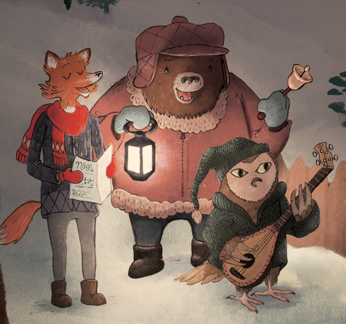
Carolers Process: Finish! (And a Merry Christmas to All of You!)

Tidings of Comfort and Joy

Here we are - the final! 
When we left off last post, I had just begun adding color to the painted elements that I had composed in the image. Now, many layers later, I've arrived at my finished piece. The basic process is just a lot of tweaking, color choices, adjustment layers (Overlay for the light areas) and texture brushes.

I hope it looks okay here on the web - I had some issues making sure that the color translated well to the web version (I painted it in CMYK, so I ended up exporting it as a PNG to make sure all the color information was intact.) I really enjoyed exploring this new method of working, and to be honest, I've learned a lot with this painting, and you'll be seeing much more of this process from now on!
 I'm really excited about this piece, and I look forward to exploring new territory in the New Year.


  So, I wish you all the Merriest of Christmases. I'm thankful for all of you and for this great gift of Illustration that we can share with each other!


PS: Today I opened my mailbox to find a lovely gift from illustrator Joe Sutphin! Inside were these beautiful signed prints and a kind note. Joe is a fantastic illustrator, and if you aren't familiar with his work, be sure and check it out here: http://joesutphin.blogspot.com/

Wednesday, December 11, 2013

Carolers Process Part II: Digital Composition & Coloring

 Hey guys! So, I haven't had a lot of time to work on this piece since the last time I posted, but I made sure to take some WIP shots of the compilation stage. Basically, I'm painting elements of the image separately, and then compiling them into a composition that I am happy with. 
 So, let's jump into it!

In the image above, I've scanned in a page of painted elements. They were all done in watercolor. After I scan these into the computer, I open the image in Photoshop where I convert it to black & white (or, Image > Adjustments > Black & White). Then I adjust the Levels until I have mostly black and a completely white background. In the images here, I actually made my levels too grey, which forced me to go back and re-do a lot of my work because the grey areas became transparent. (more on that later).
Also, note the cluttered desktop, and the Cory Godbey desktop background :)

Now I'm ready to copy everything to its own layer!

 This is a slow process. It's a good idea to have some music on to keep you motivated! (I've been enjoying the new Sigur Rós album, some Christmas music, whatever helps me work!) At this stage, I use the Lasso tool to select the element I want. I then Command + click on the RGB Channels in the Channels palette. I then invert the selection (Shift+Command+I) and make a new Layer. I then fill the selection with Black (Alt+Delete). After all this is done, I select all and copy to a new layer in my painting, and then place the new layer on Transparency Lock (it's a little button on the layer palette).
This might sound like a complicated process, but it doesn't take too long when you get it committed to memory.

Now all the elements are ready to be re-sized and moved into position.

Now that each of my elements are on their own layer and on transparency lock, I can start arranging them into a pleasing composition. This step seemed to take the longest. During the process I referred to my rough sketch frequently to make sure things were where I wanted them. Also, you'll notice that everything is a bit too transparent. That's because I didn't get the blacks dark enough in the previous Levels stage. That's important! But you can see that I'm starting to lay out the scene like I want it.

Since my layers are on Transparency Lock, this means I can color them however I want without having to do any complicated selections, so everything stays neat and tidy. At this stage, I'm just laying down basic colors. I've also discovered how to make some decent texture brushes, which I'll be using to add more color and texture to the final image. The characters are being colored here with just a flat color layer underneath the line work.

____________________
So that's about it for this stage! My goal is to have this image finished by next Wednesday, so watch this space for the final image soon. Let me know if this tutorial-type stuff is interesting to you. I want to try to give you all a glimpse into what I'm learning in hope that you'll in turn learn something as well.

And finally, I want to thank Chuck Groenink for his kind advice that he's given me personally and through his blog. I have been very inspired by his work lately, along with many others. The new methods of working I've been experimenting with are largely influenced by his paintings. Be sure and check out his work here: http://cargocollective.com/greenink

Next Time: Final Color & Texture!

Wednesday, November 13, 2013

2013 Sketchbook: News Update and WIP!


Because it is mere days until I hope to offer my new 2013 sketchbook (and due to the fact that I simply cannot wait!) I wanted to drop in a little sneak peek of a WIP painting I've been working on the last several days.

This piece entitled "Fisherman's Song" will be included in its black and white form in my forthcoming sketchbook. A color version (which you see above) will be included in a digital version of the sketchbook, which will include some bonus content, and will be available for download on Etsy. The plan is to offer the physical sketchbook, as well as a digital version which will include a few color paintings. The above painting will also serve as a promotional postcard, which I plan on sending to art directors, etc.

The above piece was created to be a part of a series of 4 new drawings that I created specifically for this personal project. I did them all over the course of The Lamp Post Guild's "Art of Personal Work" with Cory Godbey. I would strongly recommend you take this class if you're interested in building your portfolio, getting the attention of potential clients, or just interested in developing your voice as an artist in general. I cannot stress enough how beneficial this class was in my pursuit of illustration as a career, and I hope some of you will find it to be helpful as well!

Our Fall Class begins on Nov. 18th, 2013, and registration is open! You can sign up at http://lpg.pathwright.com/school/catalog/course/the-art-of-personal-work-cory-godbey/

and you can find an article by Cory on the importance of personal work (and a discount code!) here:

Thanks for reading, and I will be posting more soon!

-Will


Wednesday, August 21, 2013

TLC Workshop Recap: Monsters & Maidens

  
This past weekend I had the privilege of attending the TLC Workshop with Justin Gerard and Cory Godbey. It was a terrific weekend full of good friends, great artwork, and lots and lots of knowledge passed around! These are just a few photos from a very full weekend.

_________________

(Above) Justin Gerard demonstrated some methods of picture-making that he uses frequently, including techniques blending ink and watercolor that were used by Arthur Rackham (if you're interested in this method, a detailed description of it can be found here.)


Iain McCaig, who has worked as a concept artist for Star Wars and many other feature films, stopped by on Saturday to give us an energetic and inspiring talk on telling stories with our art and character design.


The "digital room" where I worked. The Arts Umbrella where the workshop was held was a terrific space. Small, but just right for a workshop this size.


This was the state of my Beauty & the Beast piece on Saturday night. Lots of reference lying around, and I had Just got the drawing transferred to watercolor paper and refining it. I had a pretty rough time deciding on a composition that worked for me,  so by this time I was ready to commit to a drawing just so I could try out some new watercolor methods.


Justin worked on a Beauty & the Beast illustration that was absolute dynamite. It was really nice to be able to see him work in watercolor over the course of the weekend, and I learned a great deal about the actual application of it, which has been something I've been pushing to learn recently. Justin was eager to share all kinds of knowledge about illustration and his working methods.

And here's a sneak peek photo of my drawing. It has lots of issues, but I pressed on. I told myself I couldn't go home until I had gotten watercolor on the page, which I did! I still need to finish that aspect of it, and I'll post the final when it's done.

And lastly, here's Mr. Cory demoing his digital workflow in Photoshop which he uses mainly for client work. Cory is a fine fellow, and it was great to hang out with him for the weekend. His drawings are mind-blowing works of art and I enjoy his approach to character and composition.


At the end of the class on Sunday, Justin & Cory did a Q&A with us on the business of art, how they got their start in illustration, and things that we as new artists can do to gain exposure and attention for our own artwork. It was a great session, and it really answered a lot of questions that I've had in the recent months about "where do I go from here?"

After it was over, we all took a look at each other's pieces. There was some terrific art being made over the course of the weekend. That evening we attended a farewell dinner at Vivendo's Italian Restaurant in the Country Village and it was so nice to just spend time with good friends who love art. We're all in this together! 

If you ever get the chance to attend one of Tara Larsen Chang's TLC Workshops, I would highly recommend it, especially if the guest illustrator is someone who has influenced you in your art pursuits. For me, Justin and Cory's work was a huge factor in my decision to become an illustrator, so it was a great opportunity to meet with them and learn from their work and experience. I hope that you will be able to do the same if you attend.

And with that, it's back to work for me! I have a painting to finish!

Wednesday, June 12, 2013

Winter Dragon: Watercolor (Traditional Underpainting)


So in my last post in this series, I showed you the finished drawing. Since then I've plunged into the watercolor stage of my process. This piece actually marks a lot of progress for me, for several reasons. First, this is the first watercolor I've ever done that I've felt "good" about. I've managed to achieve some pretty good texture, keep the colors within a predetermined scheme, and get a fairly unified look to the whole thing. Secondly, it's the first painting I've done that stands alone as a finished watercolor painting, but still leaves room for some digital manipulation, which I will complete in the last stage.

The image I'm posting (above) was tweaked just slightly to bring up the levels from what the scan gave me, but otherwise, it is untouched by Photoshop. Over the course of the painting stage, I used these steps, which I will give you here in case you are interested:

Here's a very poor picture of what the underpainting looked like. 
Pretty rough, huh? 

1. Light underpainting - wash of warm brownish undertones to unify the colors.
2. First washes of local color. This was the stage where I added in my midtone colors, leaving my lightest areas untouched, and saving my shadows for a later stage.
3. Final washes of darker areas - adding in shadows, etc.
4. Final touches of local color, a little more fine tuning.

The final watercolor. Wrinkled, but still alive and kicking!

That being said, there were a lot of things I learned, and things that I will do differently next time:

1. Instead of doing a wash over the whole painting, do a light underpainting on individual elements of the image, such as the trees, the dwarves, the mountains, dragon, etc. This would eliminate some of the dramatic bleeds that I got.

2. Stretch the paper. I skipped this stage, but it was only because I forgot to do this before I drew on it, and didn't want to lose my drawing. Overall, the drawing held well.

And that's about it. I'm sure there were other things I noticed but can't recall at the moment. Anyway, I got through the whole ordeal without incident, and was pretty pleased with the result!
Now I will retreat into my digital laboratory and tweak the DNA of this thing with Photoshop. We shall see what madness shall ensue!

Character detail.

Up Next: Digital Process!

Saturday, January 5, 2013

Winter Explorers

Winter Explorers
pencil & digital

Happy New Year everyone! I hope that you're all finding lots of time to make some great art in 2013. I've been off to a bit of a slow start, but I'm resolved to make 2013 the most productive art year I've ever had. I finished this little painting this afternoon - it was the last drawing I did in 2012 (finished in the final thirty minutes of the year!), and the first painting of 2013. I'm really trying to find my way
in the color world. Drawing is all well and good, but I'm working towards becoming a more 
solid painter as well this year. 
Well, I hope you're all ready to grab your walking stick and head out into the Great Unknown to see what adventures and art we can find. I know I'm ready!
Onward!

P. S. Also, very briefly, I notified the winners of the Hobbit Giveaway around Christmas - Aedan Peterson won first prize - "The Forest Goblin" drawing, and @bigjohnjeep on Twitter won "Riddles in the Dark". Congratulations to the winners, and thanks everyone for entering! I'd love to do a giveaway again soon. I mailed the drawings early this week, so they should arrive soon!
-Will

Tuesday, July 17, 2012

#163 Sermon Illustrations: Digital Speed Paintings


I was recently asked to contribute some digital paintings to illustrate a series of sermons for the local church I attend. The paintings were done quickly, only about an hour and a half for each. It was good practice to boost my Photoshop paintings skills which need a great deal of improvement.

Friday, July 13, 2012

#162 Illustration Friday: Suspend

Suspend
8.5 x 11" Watercolor & Digital
Being cast from his ship, the noble Nordic warrior finds himself suspended between the inky depths of death, and a terrible sea monster. He has two choices: succumb to a watery grave, or take hold of a legendary sword to slay his foe and rise again to air and life. I think he will choose the latter, don't you?
Done for Illustration Friday, a weekly artistic challenge.

Wednesday, March 21, 2012

#153 Sketchbook 2012: The Falconer's Blade Part III: More Local Color


Sorry for the lack of updates lately - I've been busy with various things. This is the progress on the first painting for the sketchbook so far as of yesterday. I thought it was finished and ready for digital, but I started seeing even more areas that needed contrast and shadow. This really needs to be done in the painting stage, so some more work, and then we push into the wilderness of Photoshop! And after that, more drawings. Stay tuned!

Wednesday, March 7, 2012

#152 SKETCHBOOK 2012: The Falconer's Blade Part II: Local Color


Started in on the local color for the dragon & falcon. The red became a bit purple, but I think that in the end thats what I wanted anyway. Next: more color!

Wednesday, February 15, 2012

#147 Oil Painting (Still Life)


Before Christmas last, I attended a workshop on oil painting at a local art supply store. I wanted to simply be introduced to the materials involved in oil painting, and it was a decent introduction. I have not touched oils since, simply because of one or all of these three things:

1. I haven't bought any more canvas or boards.

2. I am a procrastinator.

3. Oils are messy.

The latter statement is one that I discovered during the class. The instructor informed us (halfway through the class) that oil paints have the potential to be rather toxic. Of course, at this point I had them all over both my hands. I was not amused.

Still, however, I plan on doing more oil studies soon. James Gurney, a fabulous oil painter who works mainly in the plein-air method, will be a day lecturer at IMC this year, and I very much want to attend his class. So I hope to learn a few things before I go so I will at least be able to follow along at a limping pace.

-Will


Saturday, January 21, 2012

#143 Thorin Oakenshield: Digital Process


Thorin Oakenshield
(7 1/2" x 11" watercolor, digital)

Here is Thorin in all his digitally edited glory.
I had a lot of fun exploring this watercolor thing fully for the first time. I will say though that I was quite disappointed in the way I managed the color. I know very little color theory in general, but I knew that the helmet here was going to be gold, so in order to create a somewhat effective image, there would need to be a cooler, contrasting color (preferably in the shadow areas).
I believe that in the end it all ended up pretty muddy, because I was afraid of adding too much color into the image and making it to bright and vibrant. So, I continued to add wash after wash of light, muted color. This turned out to be somewhat of a disaster.
But there was a glimmer of hope! I could use Photoshop to improve this right? This all-powerful tool of pixel wizardry could turn even the worst of watercolors into a masterpiece! So I scanned it, and began.

The Un-Edited Scanned Painting.

The The scan was, of course, very greyed out and bland. Scanners have the evil intent of ruining your every attempt at artistic excellence. So upon entering Photoshop, I had to adjust the Levels to get the values back to normal. After this, I added several (as in five or six) Color Dodge & Color Burn layers. I painted over various areas of the painting in these layers with colors that I sampled from the image. This brightened and darkened the different colors I wanted to emphasize, and that I unfortunately wasn't able to achieve in the original painting. It also allowed me to create the illusion of the highlights "glowing". Finally, I dabbled with a Color Balance layer or two, giving the shadows a darker Violet tone to contrast the Yellows of the highlights.
Another thing that you may notice is that I eliminated those ghastly bags under Thorin's eyes with the Clone Stamp tool. I have no idea what possessed me to put those in the drawing.

So, hope you liked that little run-down of my process. Let me know what you think could use improvement. Now, on to other characters!

-Will

Wednesday, January 11, 2012

#141 Dwarfed


Assorted Dwarves in Various Stages of Completion.

Thorin Oakenshield (?)

A couple of quick Dwarf doodles/studies. Trying to pave the way for some finished Tolkienesque artwork to be finished in watercolor and digital (Yes!! Watercolor!!). I'm actually going to try William Stout's "Rackham/Dulac Method" for the finished pieces (recommended by Justin Gerard here). Wish me luck!

Monday, October 24, 2011

#116 Further Up And Further In


Reepicheep Pencil & Photoshop 8 x 5"
I received a fine set of Justin Gerard's Watercolor Blossom Photoshop brushes today, and I put them to good use. Of course, there is learning curve to them (I handle them in no way as well as he does), but there are some amazing textures in there, and I look forward to exploring them more fully in the future.
You can get your own set here.